Biko Jewellery Identity
CLIENT
PROJECT
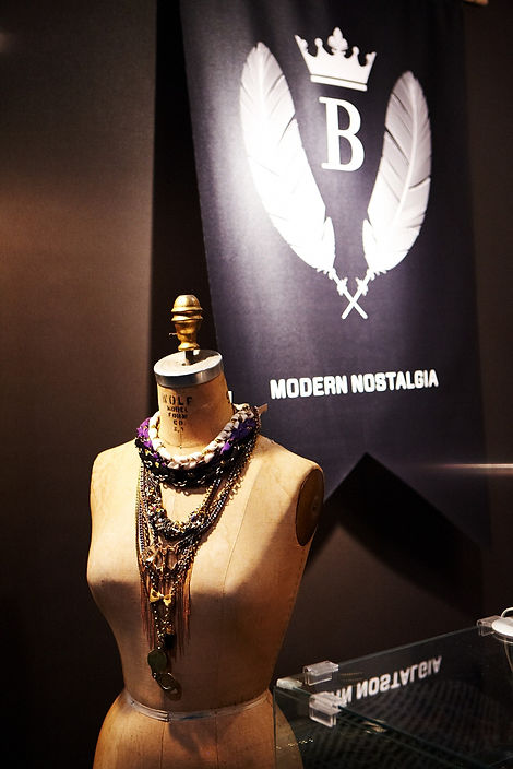
Inspired by a nostalgic appreciation of the past but committed to expressing a thoroughly modern sensibility, Biko Jewellery needed a new visual identity that would appeal to a style conscious, 20-something clientele. We rendered the simple four-lettered name in a nuanced typeface with a custom-reduced B and a hand-drawn I.
The symbol accompanying the word mark uses crown and feather imagery as a nod to traditional ornamentation, but displays them in a starkly modern black and white. The result is a distinctive, memorable brand applied consistently across all of this talented maker’s marketing materials and even incorporated into her collection.
Available online and at various stores across North America, such as Nordstrom, Free People and Nasty Gal.
SCOPE
STRATEGY
VISUAL IDENTITY
SYMBOL/ICON
TAG LINE
COPY WRITING
BUSINESS CARDS
GIFT CARDS
PACKAGING
ART DIRECTION
STICKERS
SIGNAGE
LOOK BOOKS
TOTE BAG
E-COMMERCE
CONSULTATION


BIKO FOUNDER CORRINE ANESTOPOULOS

BRAND MANTRA CARDS

JEWELLERY POUCH

BRANDED JEWELLERY TAGS


LOOK BOOK SAMPLES

STICKERS

TOTE