Connect Resource
CLIENT
PROJECT
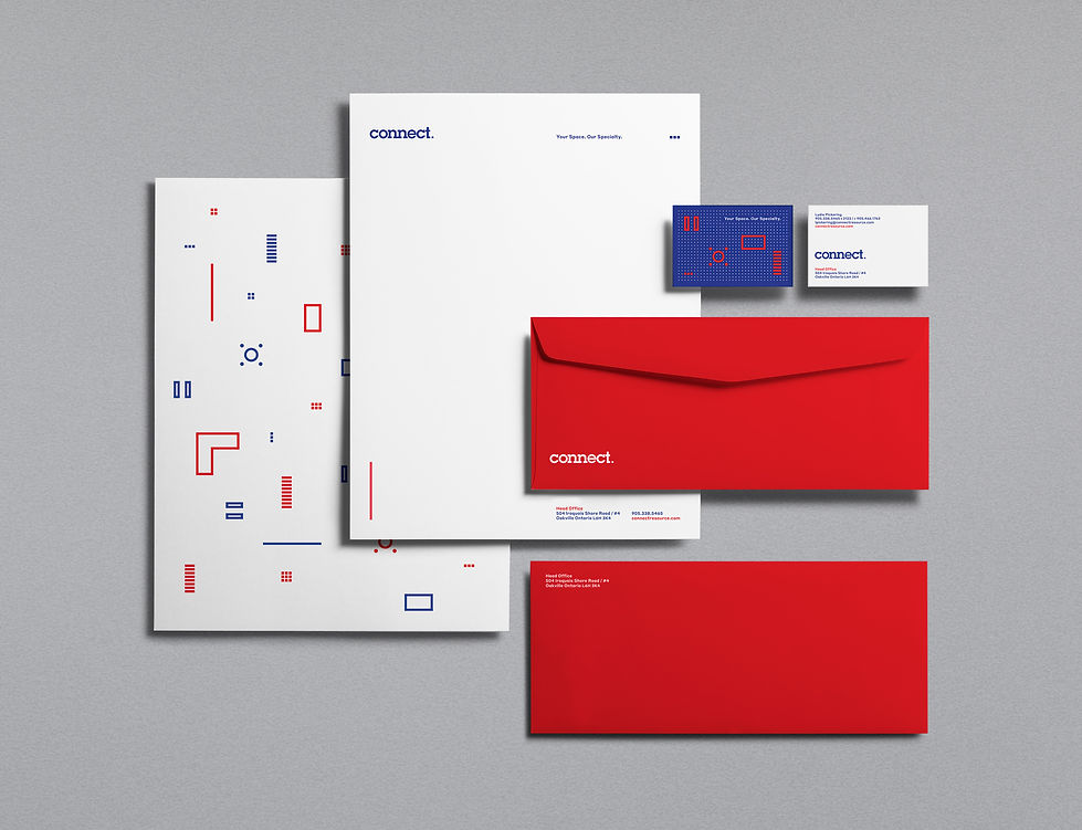
NAR’s re-brand for interior design and facility management firm Connect Resource got us thinking about how to connect the dots. Having completed 20 years of operations and recently moved into a new space in the heart of Toronto’s financial district, the firm was looking to project a new image of consummate professionalism even while maintaining a friendly, approachable demeanor. The look we created placed a number of simple geometric shapes (reflecting walls, furniture, and interior structures) on a dot-based grid, with the suggestion that the dots can be connected and reconnected in infinite ways. The firm is, we are saying, as open and flexible as the elemental designs it delivers. Supporting the presentation are energetic
blues and reds printed on a UV press. Plain white is also available
when a more restrained feel is called for. Connect Resource clients include Brookfield Properties, Oxford Properties, Manulife and QuadReal amongst others.
SCOPE
STRATEGY
VISUAL IDENTITY
PATTERNS
TRUCK GRAPHICS
INTERIOR SIGNAGE
WEBSITE
COPYWRITING
STATIONERY

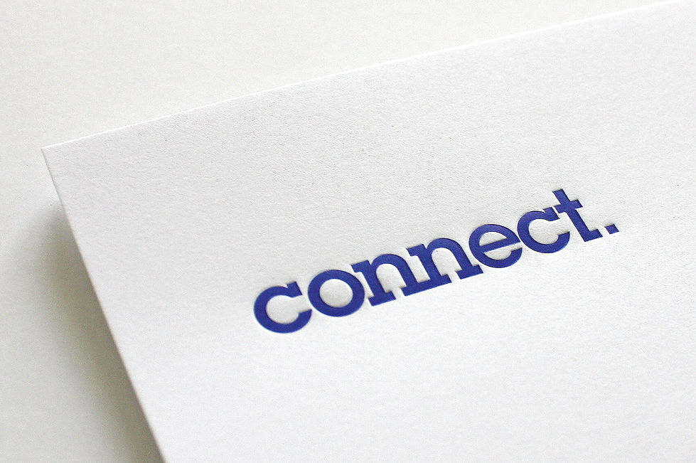
LOGO

PATTERN

PATTERN

DELIVERY TRUCK / SIDE A

DELIVERY TRUCK / SIDE B

INTERIOR OFFICE GRAPHICS

INTERIOR OFFICE GRAPHICS

TOTES

BUSINESS CARDS